
Brand & press kit
Everything you need to show Prisma.
Logos, colours, the mascot, and the rules that keep them consistent — for partners, integrations, event and podcast banners, and anyone writing about us. Grab the whole pack or a single file.

The logo
One mark, built from two parts
The primary lockup pairs the prism symbol with the Prisma wordmark. Reach for the full-colour lockup first; the pieces stand alone only where space or context demands it.

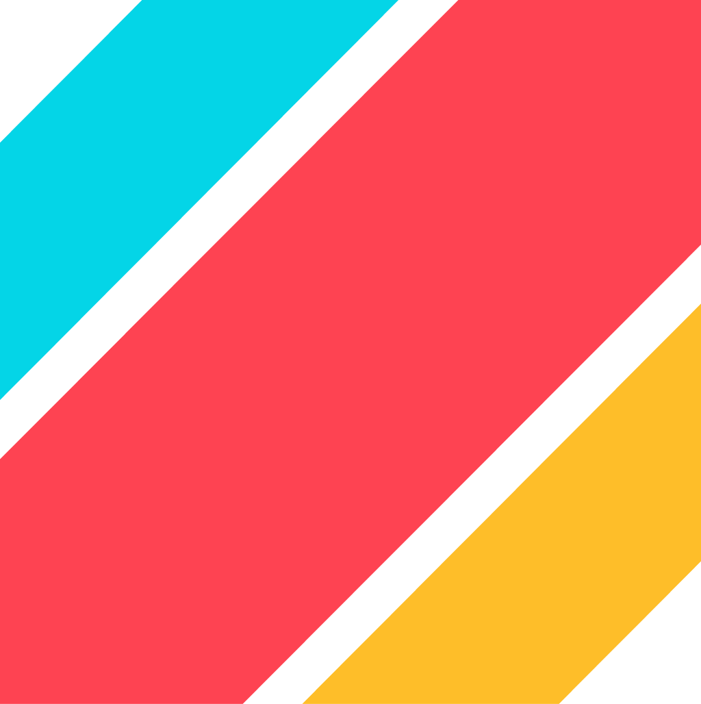
The symbol
The prism. Use alone for avatars, favicons, and square crops.

The wordmark
Prisma set in the brand letterforms.
On light

On dark
Downloads
Seven treatments, every format
Pick the treatment that carries best on your background. Each is available as SVG for screens and print, PNG, transparent PNG, and JPG.






Wordmark
The Prisma wordmark on its own, where the mark already appears nearby.



Clear space & sizing
Give the mark room to breathe
Keep clear space around the logo equal to the height of the prism symbol (1×). Nothing — type, edges, other logos — enters that zone.
Minimum size
The prism symbol is the reference for the margin — always leave at least one symbol of clear space around the logo, and never render the symbol below 16px.
- Primary lockup24px tall on screen · 12mm in print
- Symbol16px tall on screen · 8mm in print
Misuse
Please don't do these
The logo stays recognisable only if it stays consistent. Six ways to get it wrong — avoid all of them.
Don't recolour
Keep the brand colours. Never swap the palette or tint the mark.
Don't distort
Scale proportionally. Never stretch, squash, or skew.
Don't rotate
The lockup is always level. Never tilt or set it on an angle.
Don't add effects
No shadows, glows, gradients, or outlines on the logo.
Don't crowd it
Respect the clear space. Keep type, edges, and other marks out.
Don't use low contrast
Pick a treatment with enough contrast for the background.
Colour
Three prism colours on ink and paper
Cyan, yellow, and red are the spectrum the brand disperses. Ink and paper carry everything else. Click any value to copy it.
Prism Cyan
Prism Yellow
Prism Red
Ink
Paper
Typography
Sora for statements, Inter for everything else
Two open-source families do all the work. Both are free on Google Fonts, so partners can match the brand without licensing.
Display
Google FontsBuild with data
ABCDEFGHIJKLMNOPQRSTUVWXYZ
abcdefghijklmnopqrstuvwxyz 0123456789
Sora
Headlines and short statements. Weights 400–800.
Text
Google FontsThe type-safe data layer for TypeScript.
ABCDEFGHIJKLMNOPQRSTUVWXYZ
abcdefghijklmnopqrstuvwxyz 0123456789
Inter
Body copy, UI, and everything at reading sizes. Weights 100–900.
Brand elements
The pieces that make it feel like Prisma
Beyond the logo, four recurring elements carry the brand. Use them the way we do so partner-made artwork feels native, not borrowed.
The prism ray
The triple-band ray marks where something is happening or where you are — a state, never a static stripe.
Glass prisms
Any shape can be a Prisma. Translucent glass sits in the background, cropped by section edges — never over copy.
Grain
A fine film grain over colour-washed panels — present but never a visible image. Keeps flat surfaces from feeling sterile.
The cube grid
An isometric grid of cubes — the structured, composable feel of the data layer. Move your cursor over it.
Mascot
Meet Prismo
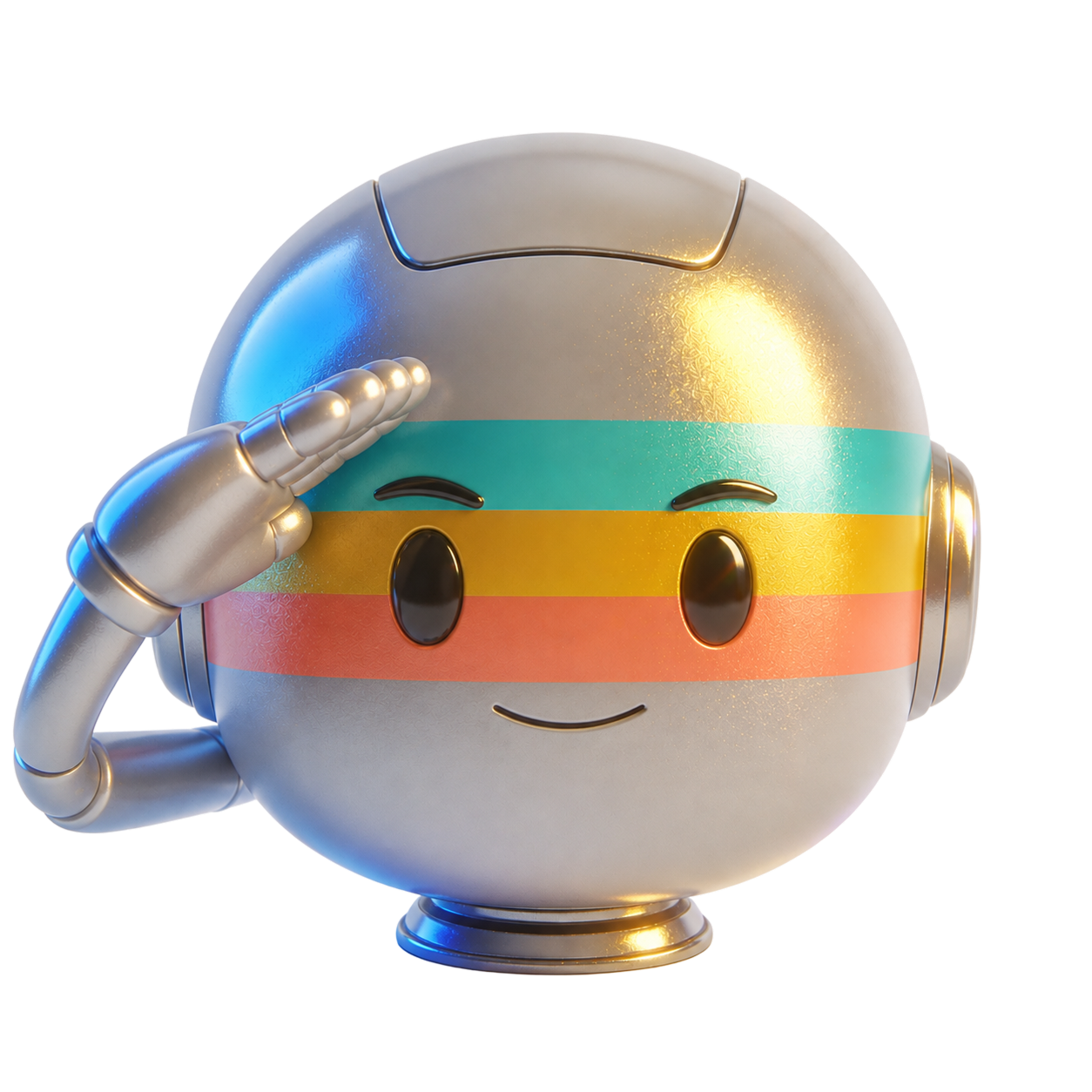
Prismo is the face of the agent — the chrome head with the prism visor you'll meet on the homepage. Reach for him where the product should feel human, and leave the logo to do the branding.

Four rules for using him
- Prismo is a character, not a logo. He never stands in for the prism mark or the wordmark.
- One expression per surface. Repeated down a page he stops reading as a character and starts reading as wallpaper.
- Match the face to the message — the sad one never carries good news.
- Keep him whole and level. No cropping past the base, no tilting, and never recolour the visor bands.
Nine expressions
One face per moment. Every expression is a transparent PNG, and all nine ship inside the master download.
















Co-branding
Putting Prisma next to your logo
For integration pages, partner banners, and podcast art, pair the marks with equal weight and honest spacing.
Your logoThree rules for a clean pairing
- Give each logo equal optical weight — match by height, not by bounding box.
- Separate the two marks with a thin vertical divider and at least one clear-space unit either side.
- Use the treatment that carries best on the shared background — full colour on light, white on dark.
Take the whole pack with you
Every logo and every mascot expression, in a single download.
- Seven treatments, SVG / PNG / JPG
- Colour values and type in this page
- Guidelines so it always looks like Prisma