End-To-End Type-Safety with GraphQL, Prisma & React: Frontend

End-to-end type safety is implemented by ensuring the types across your entire application's stack are kept in sync.
Table Of Contents
- Introduction
- Prerequisites
- Start a React application with Vite
- Clean up the template
- Set up TailwindCSS
- Define and mock your data
- Display a list of users
- Display each user's messages
- Summary & What's next
Introduction
In this series you will learn how to implement end-to-end type safety using React, GraphQL, Prisma, and some other helpful tools that tie those three together.
In this section, you will build a small React application that displays a list of users and a set of messages associated with each user. This app will be read-only, showing what already exists in the database.
In this first article, the application will only render static data instead of fetching data from a database. Over the course of the series, you will change this and add a GraphQL API with a database that your application can consume to render its data dynamically.
Technologies you will use
These are the main tools you will be using throughout this series:
- Prisma as the Object-Relational Mapper (ORM)
- PostgreSQL as the database
- Railway to host your database
- TypeScript as the programming language
- GraphQL Yoga as the GraphQL server
- Pothos as the code-first GraphQL schema builder
- Vite to manage and scaffold your frontend project
- React as the frontend JavaScript library
- GraphQL Codegen to generate types for the frontend based on the GraphQL schema
- TailwindCSS for styling the application
- Render to deploy your API and React Application
Prerequisites
Assumed knowledge
While this series will attempt to cover everything in detail from a beginner's standpoint, the following would be helpful:
- Basic knowledge of JavaScript or TypeScript
- Basic knowledge of GraphQL
- Basic knowledge of React
Development environment
To follow along with the examples provided, you will be expected to have:
- Node.js installed.
- The Prisma VSCode Extension installed. (optional)
Start a React application with Vite
There are many different ways to get started when building a React application. One of the easiest and most popular ways currently is to use Vite to scaffold and set up your application.
To get started, run this command in a directory where you would like your application's code to live:
npm create vite@latest react-client -- --template react-tsNote: You don't need to install any packages before running this command.
This command set up a ready-to-go React project in a folder named react-client using a TypeScript template. The template comes with a development server, hot module replacement, and a build process out of the box.
Once your project has been generated you will be prompted to enter the new directory, install the node modules, and run the project. Go ahead and do that by running the following commands:
cd react-client
npm install
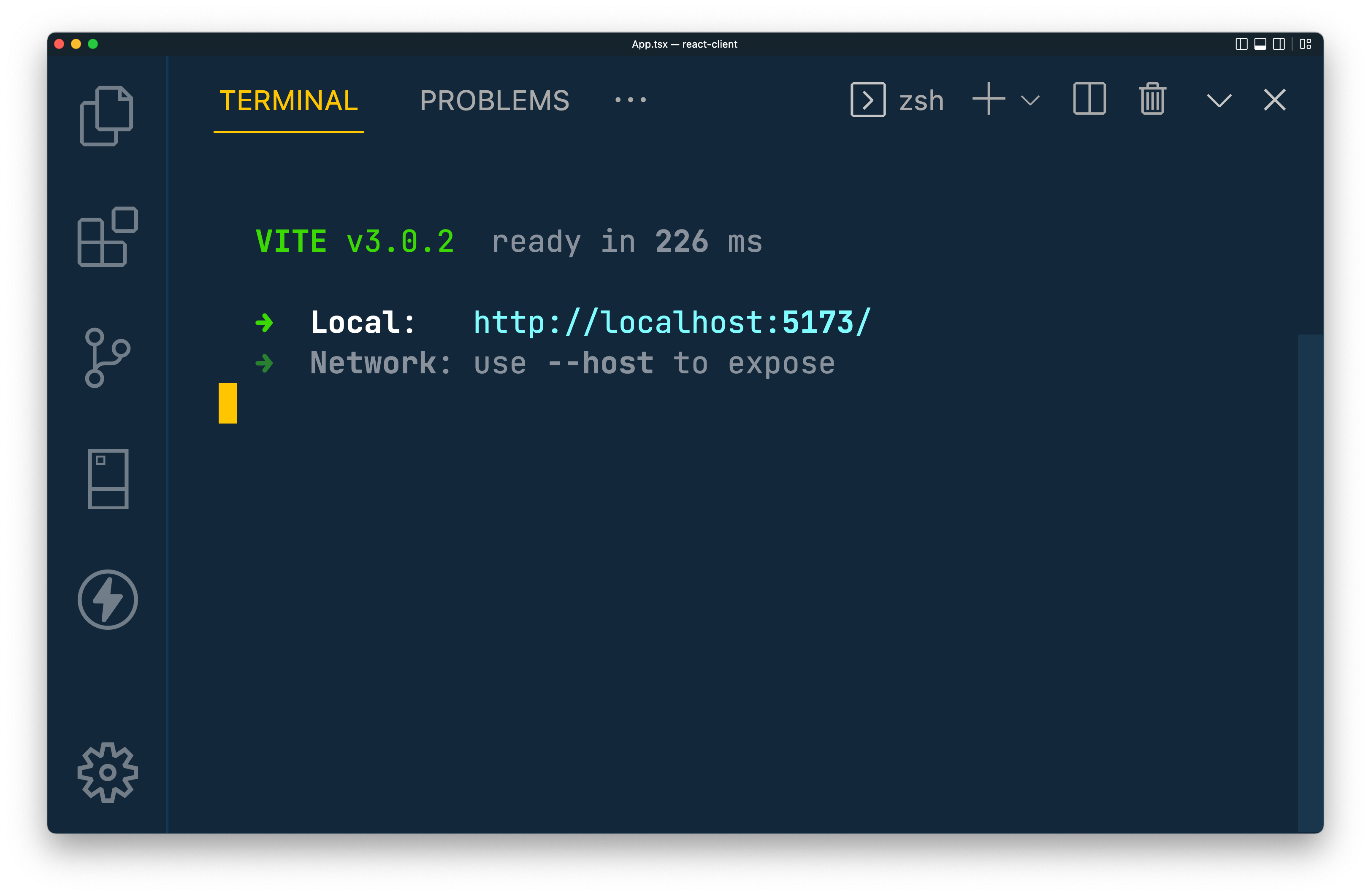
npm run devOnce your development server is up and running you should see some output that looks similar to this:
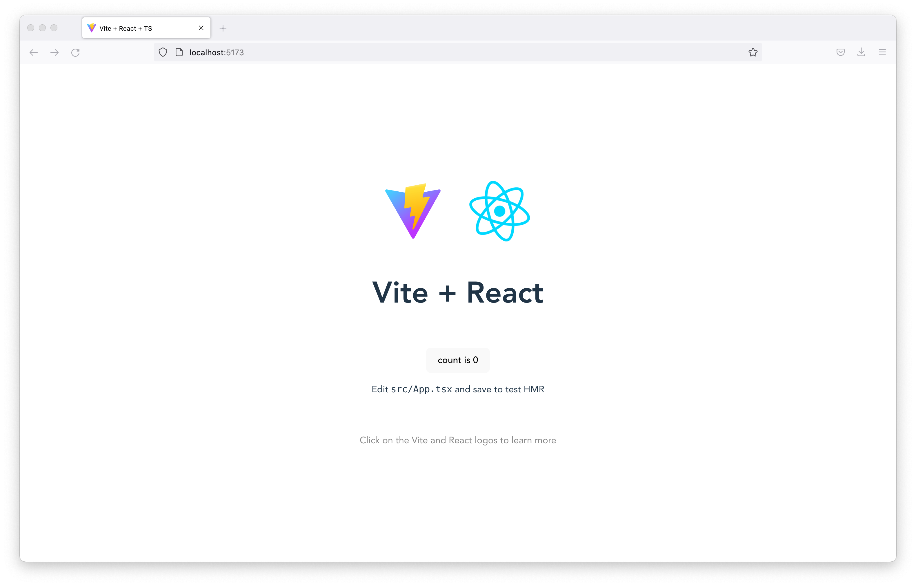
If you pop open the link from that output you will be presented with Vite's React and TypeScript template landing template page:
Clean up the template
The starter template comes with a few things you will not need, so the first thing to do is clean things up.
Within the src folder, there will be two things to delete. Remove the following:
App.css/assets(The whole directory)
Next, replace the contents of /src/App.tsx with the following component to give yourself a clean slate to work with:
// src/App.tsx

function App() {
  return (
   <h2>Hello World!</h2>
  )
}

export default App
Set up TailwindCSS
Your application will use TailwindCSS to make designing and styling your components easy. To get started, you will first need a few new dependencies:
npm install -D tailwindcss postcss autoprefixerThe command above will install all of the pieces TailwindCSS requires to work in your project, including the Tailwind CLI. Initialize TailwindCSS in your project using the newly installed CLI:
npx tailwindcss init -pThis command created two files in your project:
tailwind.config.cjs: The configuration file for TailwindCSSpostcss.config.cjs: The configuration file for PostCSS
Within tailwind.config.cjs, you will see a content key. This is where you will define which files in your project TailwindCSS should be aware of when scanning through your code and deciding which of its classes and utilities you are using. This is how TailwindCSS determines what needs to be bundled into its built and minified output.
Add the following value to the content key's array to tell TailwindCSS to look at any .tsx file within the src folder:
diff
// tailwind.config.cjs

module.exports = {
  content: [
+    "./src/**/*.tsx"
  ],
  theme: {
    extend: {},
  },
  plugins: [],
};
Finally, within src/index.css you will need to import the TailwindCSS utilities, which are required to use TailwindCSS in your project. Replace that entire file's contents with the following:
// src/index.css

@tailwind base;
@tailwind components;
@tailwind utilities;
TailwindCSS is now configured and ready to go! Replace the existing <h2> tag in src/App.tsx with this JSX to test that the TailwindCSS classes are working:
// src/App.tsx

// ...
<div className="bg-zinc-800 flex-col h-screen w-full flex items-center justify-center p-4 gap-y-12 overflow-scroll">
  <h2 className="text-4xl text-yellow-500">Hello World!</h2>
</div>
// ...
If your webpage looks like this, congrats! You've successfully set up TailwindCSS!
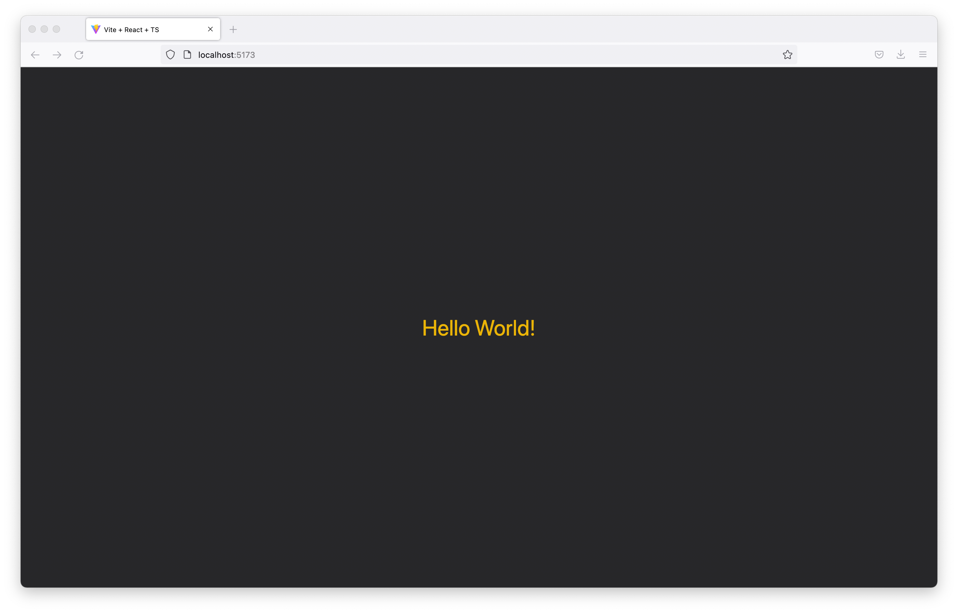
Note: If not, try restarting your development server and ensure the steps above were followed correctly.
Define and mock your data
Now that TailwindCSS is set up, you are almost ready to begin building the components to display your data. There is one more thing you will need to do first: define and mock your data.
In order to ensure your application is type-safe, you will need to create a set of TypeScript types that define your two data models: users and messages. After building those types, you will mock a set of test data.
First, create a new file in the src directory named types.ts:
touch src/types.tsThis is the file where you will store all of the types this application needs. Within that file, add and export a new type named Message with a string field named body:
// src/types.ts

export type Message = {
  body: string
}
This type describes what will be available within a Message object. There is only one key, however in a real-world application this may contain dozens or more field definitions.
Next, add and export another type named User with a name field of the string type and a messages field that holds an array of Message objects:
// src/types.ts

// ...

export type User = {
    name: string
    messages: Message[]
} Note: In the next sections of this series, you will replace these manually written types with automatically generated ones that contain up-to-date representations of your API's exposed data model.
Now that your data has been "described", head over to src/App.tsx. Here you will mock some data to play with in your application.
First, import the new User type into src/App.tsx:
// src/App.tsx

import { User } from './types'

// ...
Next, within the App function in that file, create a new variable named users that contains an array of User objects with a single user entry who has a couple of messages associated with it:
// src/App.tsx

// ...

function App() {
  const users: User[] = [{
    name: 'Prisma Fan',
    messages: [{
      body: 'Prisma rocks!!'
    }, {
      body: 'Did I mention I love Prisma?'
    }]
  }]

  // ...
}

export default Apps
In the snippet above, you defined a single user who has two associated messages. This is all the data you will need to build the UI components for this application.
Display a list of users
The first piece of the UI you will build is the component that displays a user. Create a new folder inside of the src directory named components:
mkdir src/componentsInside of that folder, create a file named UserDisplay.tsx:
touch src/components/UserDisplay.tsxThis file wil contain the user display component. To start that component off create a function named UserDisplay that returns a simple <p> tag for now. Then export that function:
// src/components/UserDisplay.tsx

function UserDisplay() {
  return <p>User Component</p>
}

export default UserDisplay
This will serve as the skeleton for your component. The goal here is to allow this component to take in a user parameter and display that user's data inside of the component.
To accomplish this, first import your User type at the very top of src/components/UserDisplay.tsx:
// src/components/UserDisplay.tsx

import { User } from '../types'

// ...
You will use this type to describe what a user property in your UserDisplay function should contain.
Add a new type to this file named Props with a single user field of the User type. Use that type to describe your function's arguments (or "props"):
// src/components/UserDisplay.tsx

import { User } from '../types'

type Props = {
    user: User
}

function UserDisplay({ user }: Props) {
    return <p>User Component</p>
}

export default UserDisplayNote: The
userkey is being destructured within the function arguments to allow easy access to its values.
The user property allows you to provide your component an object of type User. Each user in this application will be displayed within a rectangle that contains the user's name.
Replace the existing <p> tag with the following JSX to display a user's name with some nice TailwindCSS styles:
// src/components/UserDisplay.tsx

// ...
function UserDisplay({ user }: Props) {
    return <div className="flex gap-x-24 justify-center">
        <div className="rounded-sm flex justify-center items-center drop-shadow-md bg-neutral-700 w-48 h-20">
            <p className="text-xl text-gray-200 font-bold">
                {user.name}
            </p>
        </div>
    </div>
}
// ...
This component is now ready to display a user's details, however you are not yet rendering it anywhere.
Head over to src/App.tsx and import your new component. Then, in place of the current <h2> tag, render the component for each user in your users array:
// src/App.tsx
import { User } from './types'
import UserDisplay from './components/UserDisplay'
function App() {
const users: User[] = [/**/]
return (
<div className="bg-zinc-800 flex-col h-screen w-full flex items-center justify-center p-4 gap-y-12 overflow-scroll">
{
users.map((user, i) => <UserDisplay user={user} key={i}/>)
}
</div>
)
}
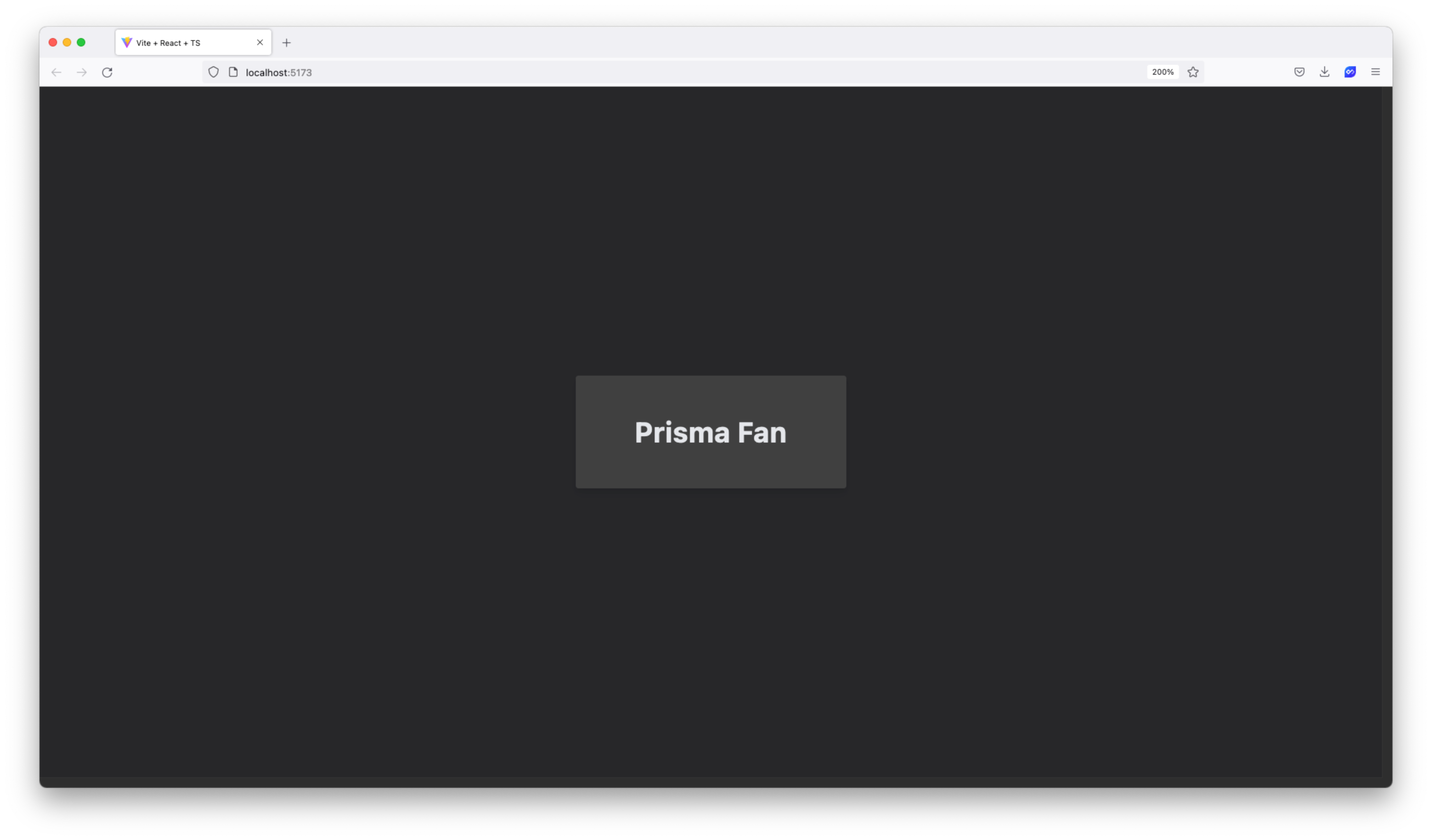
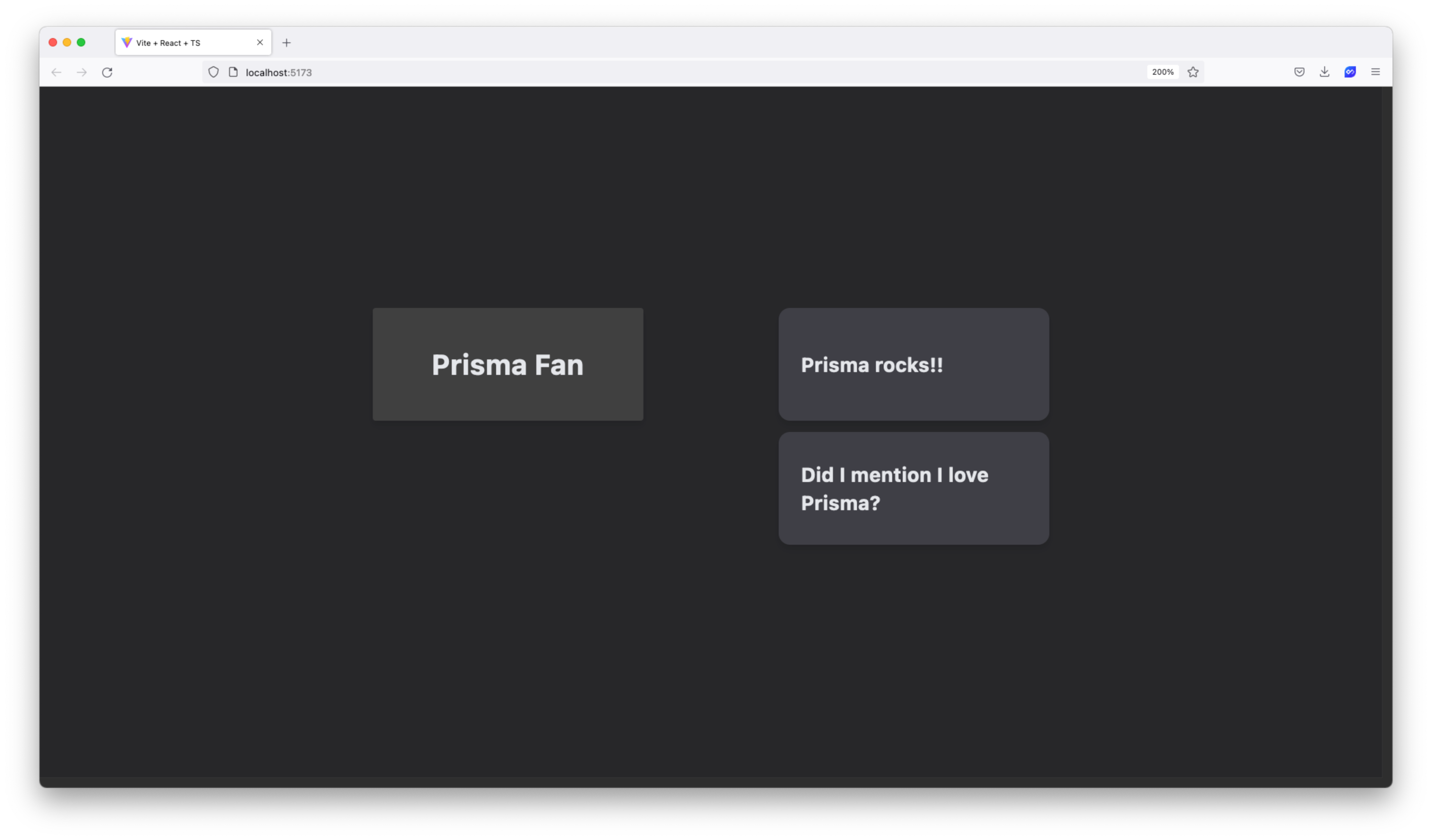
export default AppIf you head back to your browser you should see a nice box displaying your user's name! The only thing missing at this point is the user's messages.
Display each user's messages
Now that you can display your users, you will display the users' associated messages. You will create a sort of "tree view" to display the messages in.
Start off by creating a component to display an individual message. Create a new file in src/components named MessageDisplay.tsx:
touch src/components/MessageDisplay.tsxThen, import the Message type from src/types.ts into the new file and create a Props type with two keys:
message: AMessageobject that holds the message detailsindex: Anumbervalue that holds the index of the current message from the parent's list of messages
The result should look like the snippet below:
// src/components/MessageDisplay.tsx

import { Message } from '../types'

type Props = {
    message: Message
    index: number
}
With those pieces in place, you are ready to build the component function. The code below uses the Props type you wrote to describe the function arguments, pulls out the message and index values using destructuring, renders the message in a styled container, and finally exports the component:
// src/components/MessageDisplay.tsx

// ...

function MessageDisplay({ message, index }: Props) {
    return <div className="group mb-2 shrink-0 rounded-lg flex items-center drop-shadow-md bg-zinc-700 w-48 h-20 relative">
        <p className="text-sm text-gray-200 font-bold px-4">
            {message.body}
        </p>
    </div>
}

export default MessageDisplay
Now it's time to put that component to use! In src/components/UserDisplay.tsx import the MessageDisplay component and render one for each element in the user.messages array:
diff
// src/components/UserDisplay.tsx

+import MessageDisplay from './MessageDisplay'

// ...

function UserDisplay({ user }: Props) {
    return <div className="flex gap-x-24 justify-center">
        <div className="rounded-sm flex justify-center items-center drop-shadow-md bg-neutral-700 w-48 h-20">
            <p className="text-xl text-gray-200 font-bold">
                {user.name}
            </p>
        </div>
+        <div>
+            {user.messages.map((message, i) => <MessageDisplay key={i} index={i} message={message} />)}
+        </div>
    </div>
}
// ...
Over in your browser, you should now see each user's messages to their right!
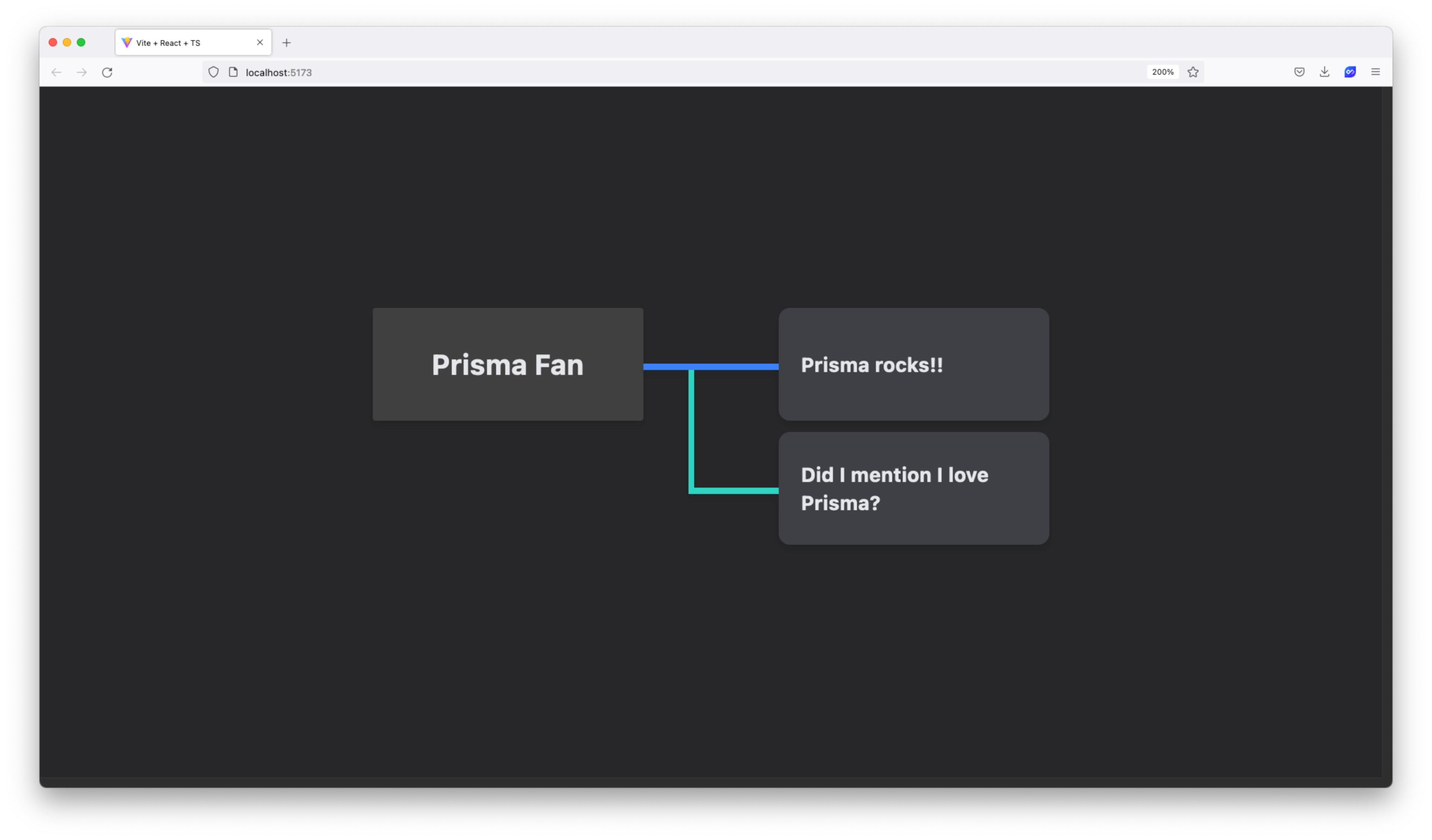
That looks great, however there is one last thing to add. You are building a tree view, so the final piece is to render "branches" that connect each message to its user.
Create a new file in src/components named Branch.tsx:
touch src/components/Branch.tsxThis component will take in one property, trunk, which indicates whether or not the message it links to is the first in the list.
Note: This is why you needed the
indexkey in theMessageDisplaycomponent.
Insert the following component into that file:
// src/components/Branch.tsx

function Branch({ trunk }: { trunk: boolean }) {
    return <div
        className={`
            ${!trunk ? `border-l-4` : ''}
            ${trunk ? 'w-24' : 'w-16'}
            ${trunk ? '-translate-x-24' : '-translate-x-16'}
            scale-y-110
            transition
            ease-in-out
            duration-300
            group-hover:border-teal-400
            h-full border-blue-500 border-b-4 absolute -translate-y-10`}
    />
}

export default Branch
The snippet above renders a branch with some crafty TailwindCSS magic. If you are interested in what TailwindCSS has to offer or want to better understand what is going on above, TailwindCSS has amazing docs that cover all of the classes used above.
To finish off this application's UI, use the new Branch component within your MessageDisplay component to render a branch for each message:
diff
// src/components/MessageDisplay.tsx

import { Message } from '../types'
+import Branch from './Branch'

type Props = {
    message: Message
    index: number
}

function MessageDisplay({ message, index}: Props) {
    return <div className="group mb-2 shrink-0 rounded-lg flex items-center drop-shadow-md bg-zinc-700 w-48 h-20 relative">
+        <Branch trunk={index === 0} />
        <p className="text-sm text-gray-200 font-bold px-4">
            {message.body}
        </p>
    </div>
}

export default MessageDisplay
Back over in your browser, you will now see branches for each message! Hover over a message to highlight the branch ✨
Summary & What's next
In this article, you built the frontend piece of your fully type-safe application. Along the way, you:
- Set up a React project
- Set up TailwindCSS
- Modeled and mocked out your data
- Built the UI components for your application
At this point, the data and types in your application are static and manually built. In future sections of this series you will set up dynamic type definitions using code generation and use dynamic data from a database.
In the next article, you will begin to build your API, set up your database, and initialize Prisma in your project.
Build your next app with Prisma
Start free. Scale when you’re ready.